

Showing my work on the New Zealand Database - for number junkies only

A couple of people have seemed a little disbelieving of what I found.
I figure SOMEBODY has to be the engineer at NASA who says “Hey, don’t launch the shuttle if it’s less than 40 degrees outside, the O-rings lose their plasticity!”
I once told my boss one of my clients needed to be holding $6 million more in reserves on a fairly small block of business once; the reserves had been calculated using an excel spreadsheet where the tables only went out to 20 years and we were well past twenty years. You are supposed to be able to do that in the actuarial business and have your bosses all the way up the ladder do what needs to be done, with no weaseling out of the requirements and no shooting the messenger. He did do that, but I realize now that isn’t always the case.
Anyway, here is a chart from the New Zealand government itself showing when the COVID “Vaccines” were administered:
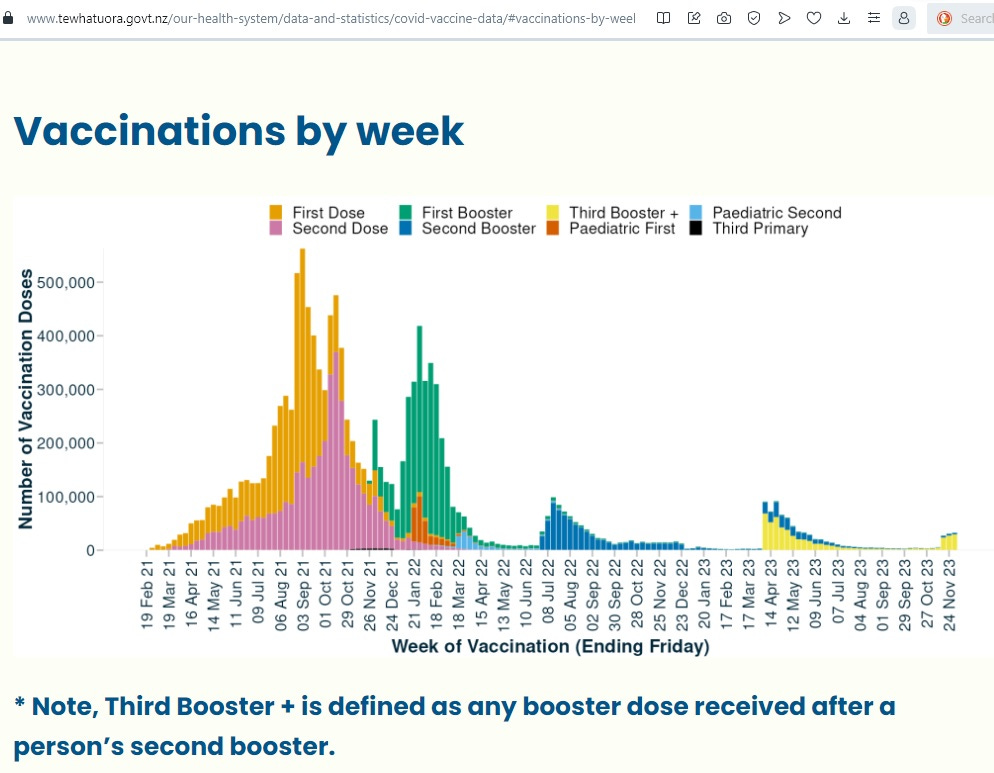
New Zealand says that over 90% of the population age 12 and up got at least two shots of the COVID “vaccines”.
I would show the chart showing how many “vaccines” are contained in the New Zealand database, by date of administration, but WelcomeTheEagle’s dashboard is down now. I took screenshots of the administered doses by age groups previously. Here’s the one for people in their 70s:
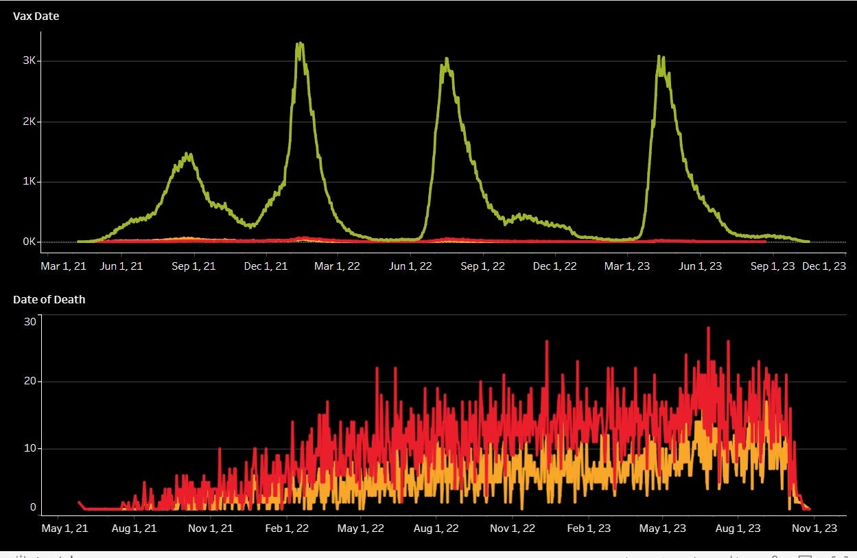
The first hump corresponds to people taking their 1st and 2nd shots, and the other three humps correspond to the 3rd, 4th and 5th shot. Needless to say, anyone who took the 3rd shot also took the 1st and 2nd shots, and you can see that is not reflected in the database. The database was just not picking up many shots in 2021 for any age groups.
Here are my calculations for the 70-74 and 75-79 age groups.
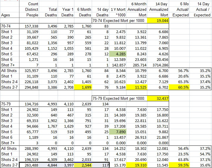
For example, to get the 6 month annualized mortality for the 70-74 year old group, shots 2-7 (I’m handling shot 1 separately because normally people would get their second shot two or three weeks later),
1,699 deaths / 294,848 shots * 2000 = 11.525 deaths per 1000 on an annualized basis. Divide that by the expected mortality of 19.044 to get the actual to expected ratio of 60.5%.
These “vaccines” are NOT the fountain of youth, so the only conclusion is that many, if not most of the deaths are not recorded here.
Oddly enough, the deaths for shot 5 are low for most of the older ages (highlighted in light green in the spreadsheet screenshot), and high for shot 6 and 7 for most of the older ages, compared to expected. Maybe they used placebos in the fifth round?
Reader Stickdog had a very good comment on my last post that had a link to some good information on New Zealand’s raw deaths. I made a long comment in response to that. One or two people might be interested in looking at those. But the very short version of my response is a guess that New Zealand clot shot deaths might be in the range of 1.2 per thousand so far. That’s not per shot - some people took several shots before they died of the effects.
Thanks for reading.
In what the late Saddam Hussein once dubbed “the great Satan,” roughly two-thirds of the United States enlisted military corps is white . . .
The fat, bulbous U.S. Secretary of Defense Lloyd Austin once confirmed in a 93-2 vote of the U.S. Senate, immediately embarked on a whirlwind media tour of duty, telling the pseudo-secular sycophants in the state-controlled tabloid press and state-controlled television talk show circuit about how the U.S. Army is full of bad racist white men.
And now the U.S. Army is doing ads begging for more young white males? What happened?
Even with a full-on declaration of war from Congress, and even if Gavin Newsome could be cheated into the Oval Office by ZOG somehow, with Globohomo diversity brigades going door-to-door looking to impress American children into military service, they will be met with armed, well-trained opposition, the invasion at the Southern border is going full tilt, and the drugs are flowing in like never before . . .
People are done fighting wars for these psychotic kikesucking Zionist ass-whores . . . With the borders of Europe and the USA wide open, civil warfare within the USA, Britain, and most of Europe is a certainty if foreign wars are initiated. Nobody is going to fight a war for Biden, he is dumber than Bush . . . Nobody is going to fight a war for that kikesucking Zionist ass-whore Nikki Haley, and I mean nobody.
Get ready for it . . . the fat old devil worshipping fags on Capitol Hill, on Wall Street, in Whitehall, and in Brussels are in no shape to fight a war themselves, and most Americans are armed to the teeth with their own guns . . .
https://cwspangle.substack.com/p/satanism-is-a-jewish-cult
These data seem to indicate the shots reduce the mortality rate by about 40-60%; yet all cause death rates are horrifically high during the period. One can only attribute this to healthy user bias, the fairly high percentage of people who were literally on death's doorstep at the time the doses were rolled out not having received the shots, and having subsequently died at a very high rate among a very small population. Such a bias is not easy to filter out of general populations, . But all cause deaths for entire populations will reveal such a signal.